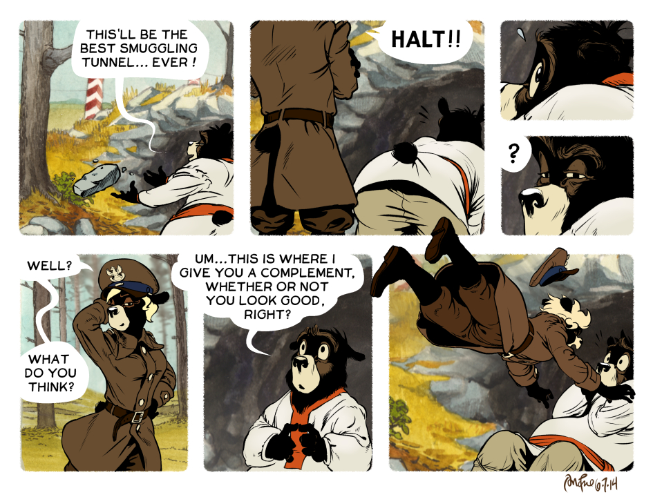
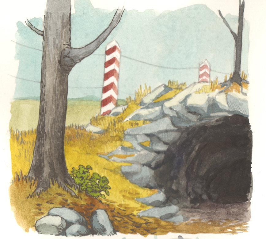
Trying a couple new things here. I did the backgrounds in watercolors, and I’m pretty happy with the overall vibe. I created a real design problem though, by having Malutki–whose head and hands are mostly black–framed by a dark tunnel opening. I ended up digitally washing out the darks of the tunnel so that he would read.
I’m also trying out a couple new typefaces here. I’ve been growing less and less satisfied with “Donacomix,” the font I created a couple years ago, based on my own handwriting. My mother-in-law was cleaning out her attic, and found a set of art instruction books from the 1950s–they were part of a correspondence course in commercial art and graphic design. One book, on lettering, is filled with incredibly beautiful specimens of hand-drawn and hand-painted alphabets.
I scanned a few, and have been creating digital typefaces from them. The two below are my favorite, so I wanted to see how they looked in a comic.
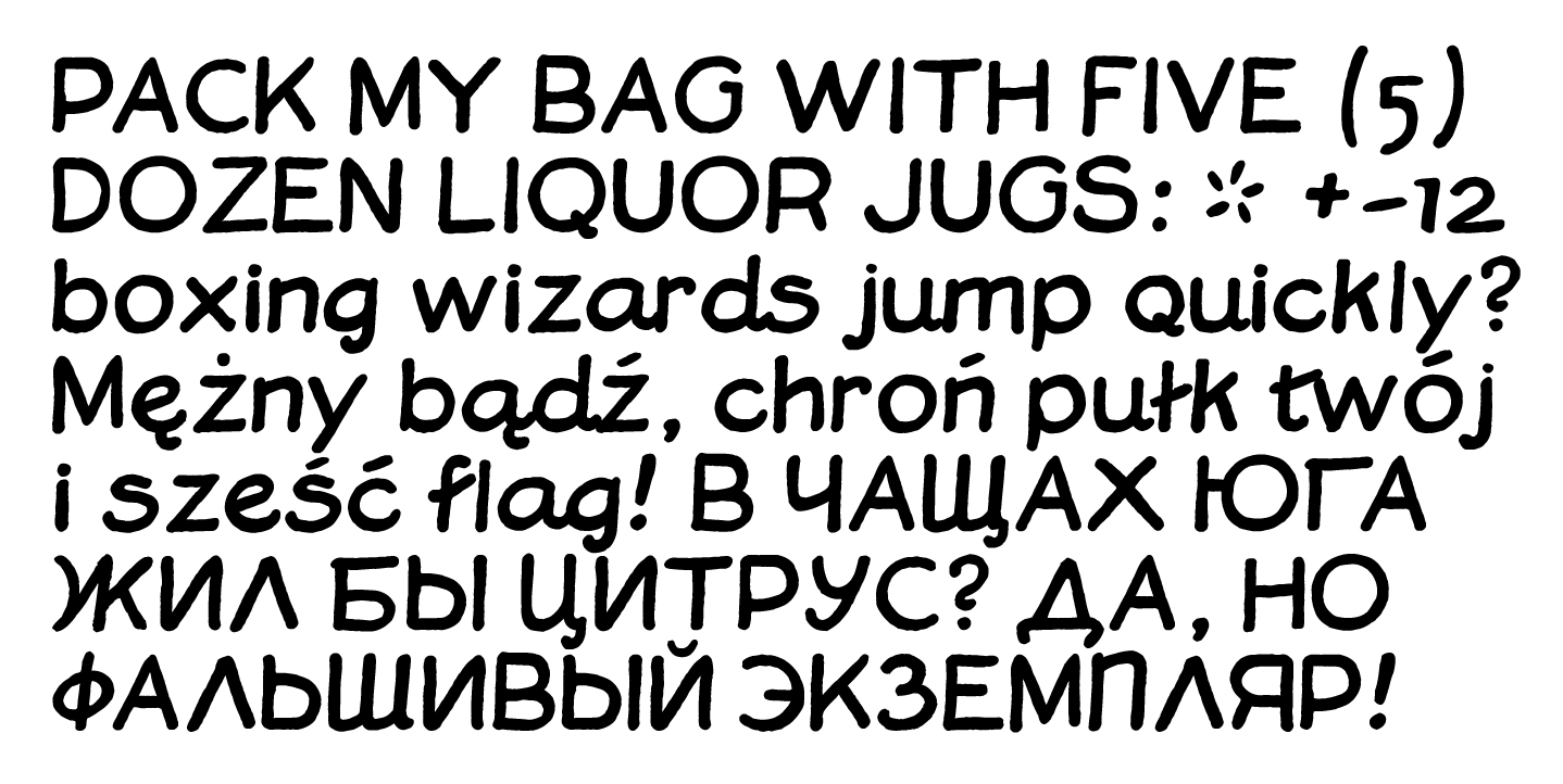 I love the quirk of the lower-case “q” as a small capital, and the swash-tailed “a” and “d.” I added numerals, a few sorts, and Polish and Cyrillic characters. The second alphabet is from an illustration of single-stroke, painted letters for “card writing:”

The oversized bowls on the “P” and “R,” and the tapered ends on “C,” “J,” and “S” are probably my favorite features.
Anyway, I’m not sure if I’ll stick with these for word bubbles, but they seem more historically appropriate for the world of the comics.
I like the watercolor background – it gives the characters an almost 3-D effect.
Though I’m sure you already decided at this point, I think it would be an interesting approach to have the two different fonts used to distinguish between the Polish and Belarusian characters. I recall the familiar Asterix comics by Goscinny and Uderzo have used a similar approach in depicting the speech of those from different lands.
I nearly want to hug the poor papa bear, after this one.
No, no, no! You NEVER say what you’re thinking to a woman. It ain’t healthy. LOL.