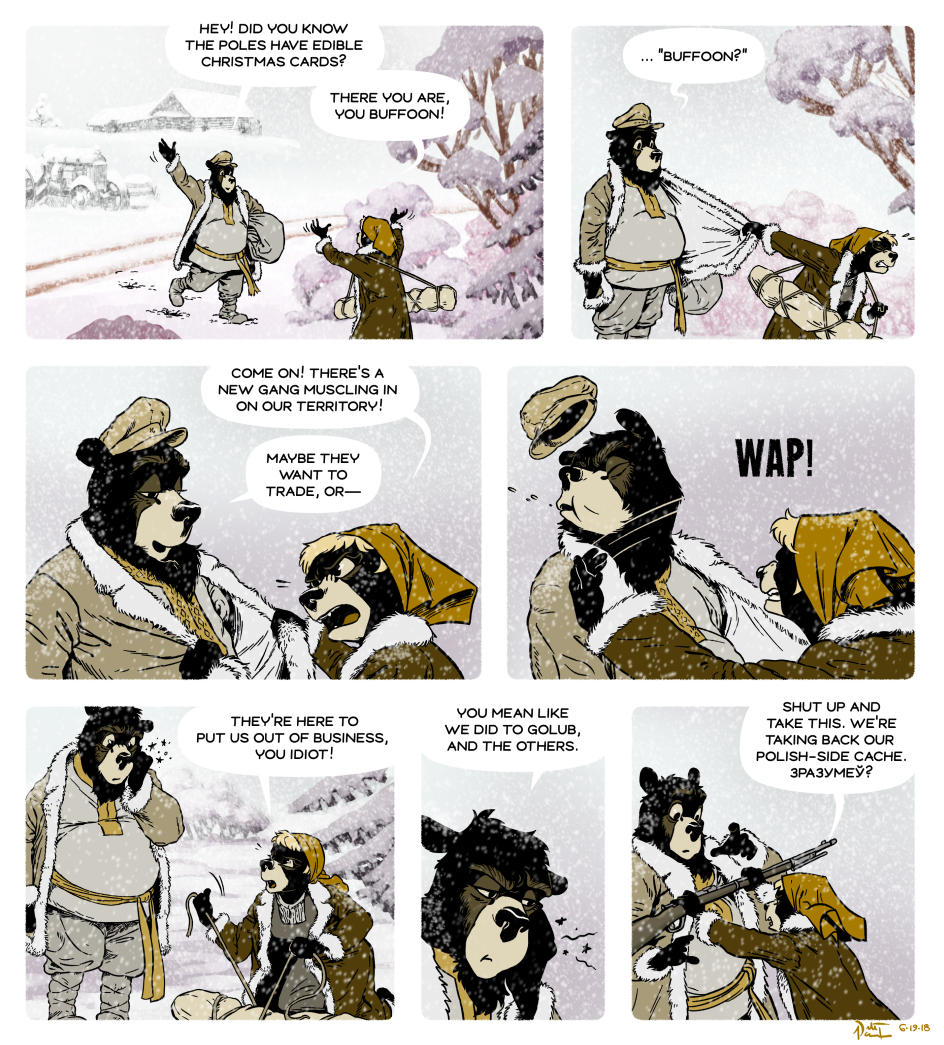
Poor Malutki.
You might notice some slight adjustments to character design here. You also might not. ;)
Also, I tried something with the colors. The background is built up of analogous hues, centered on purple, and the characters are in a monochromatic scheme. I think this ends up giving the characters greater cohesion and readability.
I’m almost unsure if the new guys in town are fellow entrepreneurs or not.
As for the character and backgrounds matching up better, they really do. Very clear.
Abaggijawah shares my feelings … the new guys” seem to have an OGPU vibe.