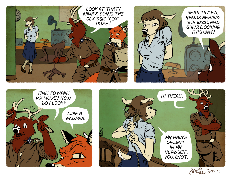
Szpadel doesn’t quit…maybe Nina will eventually find it endearing.
This comic is kind of a throwback to the more minimalist backgrounds I had going for a while. I also left the characters’ color flat. After shading them in more detail for a couple comics, I find that I prefer to try to create the illusion of space, weight, dimension, etc. through solid drawing, staging, and composition. Shading speaks a different language–one where form and dimension are suggested by the interaction of light with the masses of color… and when I try to do both (define the solidity of the characters with both composition/staging AND shading) it just seems to break up the design. Or rather, it seems to make it all harder to read.
Maybe I’m overanalyzing.
Also, I pencilled this one on a comic art board:
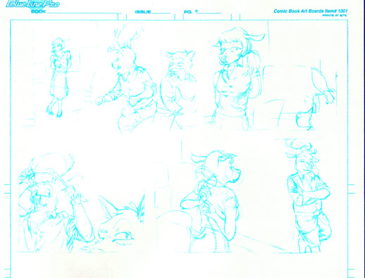 I did this with a view to inking the comic traditionally as well, so I could compare the results of the digital inks and the traditional inks. I may still do that at some point. But I wanted to get this posted :)
Hi, I like the wrinkles a lot. The inking is really nice for them. But the diffenrence in contrast between the heavy character lines and the bleak background is disturbing.
Thanks for the feedback, it helps!