I’ve said before that when it comes to comics art, my main influences are animators. I’ll take Kahl over Kirby any day. Master character animators and layout artists have taught me a few things. And I feel that other comics artists might benefit from considering the following two ideas.
Compose Backgrounds like a Theatrical Set Designer.
Your characters are players on a stage. When it comes to designing your environments, realism should not be your aim. The environments should contribute, structurally, to the tensions that push the narrative forward. The Nine Old Men knew this; so does Guarnido.
Look at the backgrounds Walt Peregoy designed for 101 Dalmatians and The Jungle Book. (Sadly he just passed away last month. But Peregoy’s contributions have begun to be recognized in recent years, at least within the animation art community.) There are some great examples of his work in Cartoon Brew’s obituary. There’s also a great analysis of color-scripting and composition in 101 Dalmatians here.
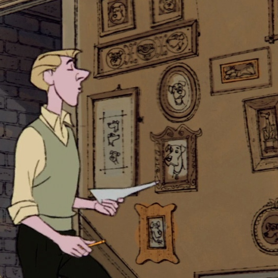
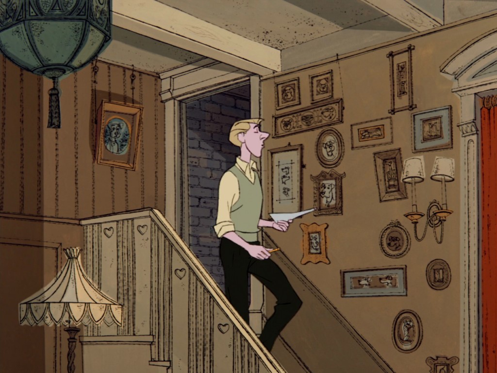
Let’s have a look at Rodger going down the stairs while singing “Cruella De Vil.” He eases the tension of her visit with every step as he descends:
Everything about this background is absolutely perfect. Consider how carefully managed the contrast is. The darkest, most saturated colors reinforce the direction and boundaries of Roger’s path of motion. The drawing is “busier”–contains more details, more broken up space–along the wall Roger walks in front of. Our eye is attracted to the busy space, and repelled like a magnet from the emptier spaces to the left. And notice the gap among the pictures on the wall: in a moment, Roger will lean there.
Here’s an example of how I’ve tried to apply these ideas to my comics art.
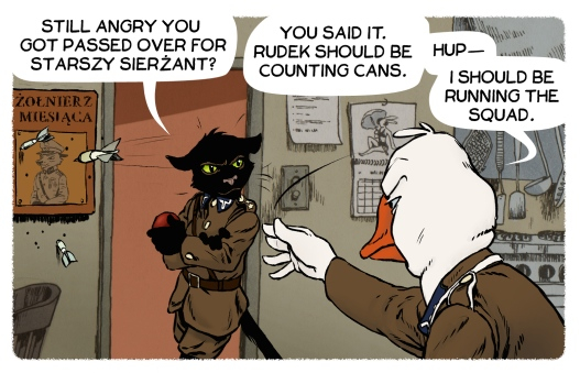
In the above panel, I’ve paid careful attention to the position, color, and saturation level of all the background elements. My aim was to have them support the action (throwing a dart) by guiding the eye. The empty, higher-saturation, opposing-hue area around Czerep pools tension around him. The busiest areas of the background are placed along the path of the swing of Kowak’s arm; the high contrast line created by the doorjamb intersects the moving dart.
To sum up: set the stage for action, for narrative tension.
Imply Weight as a Function of Motion.
You’ve heard of people who “throw their weight around.” Old Disney animators loved to make this literal, especially Kahl. So you get characters summoning their courage by shoving their gut up into their chests, yes. But you also get clear lines of action that follow through a character’s figure. These lines imply action and movement that continue beyond the body.
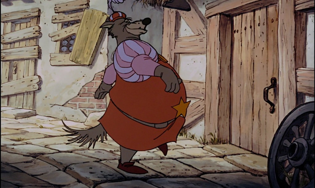
Take, for example, Kahl’s Sheriff of Nottingham:
The bulk of his stomach is perfectly balanced against the curving line of action, from his cap to his toe, to imply forward motion.
All well and good for animation–but what about for comics art? In Understanding Comics, Scott McCloud theorized about closure–the mental process that allows us to fill in the narrative cause-and-effect between panels of a comic book. I believe the same kind of active mental process allows us to anticipate the result of an action. “Anticipate” doesn’t seem an adequate word. We desire the result; our mind runs ahead to it. When we read a properly posed figure in a comic book, we aren’t perceiving only one picture.
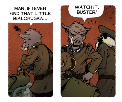
Drawings should acknowledge the effects of weight on momentum. This way, the drawings can better create this “anticipation” effect. Here’s a 2-panel sequence where I could have done that better:
I tried to imply the centrifugal force of Lucky’s bag. He leans into the turn, and the bag certainly seems heavy–lines radiate from the leather handle. But the bag fails to imply a legible arc of motion. Lucky’s elbow sort of does, but the bag should be flying more outward to show that centrifugal pull.
Studying Animation Improves Comics Art
A lot of developing comics artists put style first, I suppose because they are self-consciously trying to define their style for one reason or another. As part of a “school” or genre (shojo manga, for example) or editorial in-house style (Marvel’s heavily Ditko-influenced “classic” style, for example). One phrase that rankles me particularly is “industry standard.” This vague definition of style is often thrown at aspiring comics artists. Editors will explain why the artists’ drawings of realistically-proportioned women are not marketable–they’re not “industry standard.” Anyway.
Find your “masters”–the artists who inspire you–and study the structure of their work, not the style. My masters just tend to be animators, and I hope this article has helped you to see why.
By studying cartoonists who developed techniques for a moving medium, we can instill some life and vigor into the comics page.
—
Acknowledgments: the frames from 101 Dalmatians and Robin Hood are copyright Disney, and reproduced for educational purposes. They are copied from disneyscreencaps.com.
The background composition one especially strikes a chord with me. I’ve been reading a book on cinematography lately, in order to improve the boring “direction” of my panels.
I did pick up a couple of new things, but it mostly helps rationalize things you’ve been doing already, by intuition alone. Great article, and I think you could take a look into cinematography as well. The visual language of cartoons is often borrowed from live action movies.
Have you read Framed Ink? It’s a great book on composition and layout that speaks to both cinematography and comics at the same time.