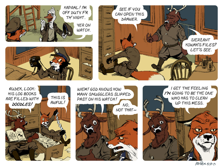
Rudek’s got a bad feeling about this.
What I learned
Creating this comic, I think I’ve come to realize that it’s high time to abandon the conceit of a limited palette. For the past few comics I’ve started to branch out from my twelve-color palette, and manipulated hue, saturation, contrast, etc. I’ve been basically moving on to multiplane compositions — panels with a foreground, middleground, and background. And the limited palette has been straining against its limits.
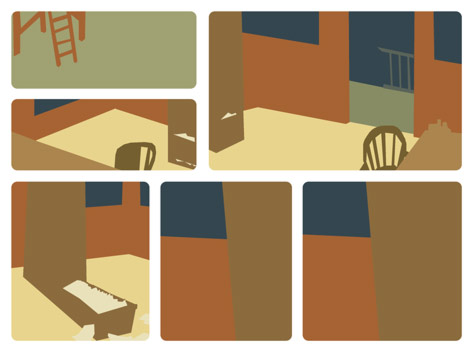
In this comic, I didn’t even start from my palette. I started coloring with the background, and knew I wanted a mostly warm backdrop with some cool accents, all with a lower average chroma than the foreground. And I was really pleased with how it came out:
There’s a problem brewing, though. The more fussy I get with color, the more it annoys me that my two monitors display colors differently. And that every time I save the art as a jpg, the colors are tweaked.


Hey, I love this webcomic! You’re doing a great job. Rudek is a really fun character, the artwork is terrific, and the setting is certainly unique (the Soviet/Polish border in 1929?). I’m very impressed. Can’t wait to see the graphic novel you’re working on, too!
I write/draw a webcomic, CHIVALRY AND KNAVERY. I’m no artist but I think the strip is funny, so if you get a chance, give it a look. And please keep running more of Rudek!
You have a polished artistic style I find refreshing. Keep up the work you do. Rudek is one of my favorite comics.