Reflections on the Process
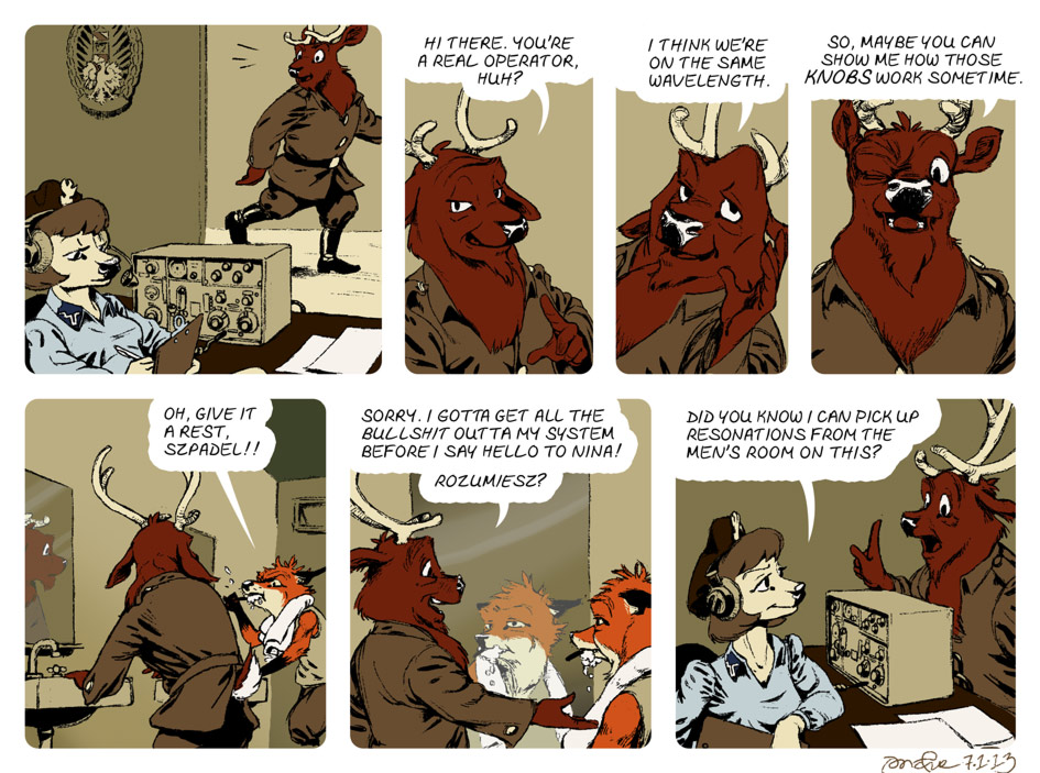
For this cartoon, I further explored the effects I could create with subtle use of the “burn” and “dodge” tools. Mostly in the mirrors, but also to shade below the sink in panel 5.
I also desaturated the colors and linework for the figures appearing in the mirrors.
I’m noticing now the tangent in panel 6 — the line between Rudek’s orange and white fur, in his reflection, is in tangent with the edge of his towel. I’m also unsatisfied with the angle of his toothbrush in the reflection — but otherwise, I think I did an okay job eye-balling the perspective in that panel.
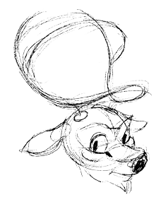
In the course of drawing this comic, Szpadel’s design underwent some changes. I wasn’t happy with the structure of his face. But the big issue I was having was getting the antlers to look three-dimensional.
So I went back to one of my resources: Ken Hultgren’s Art of Animal Drawing. I adapted the flowing, elegant structure-lines Hultgren used to define the shape of the antlers. And this got me where I wanted to be.
 For some reason, imagining these abstract, looping curves in three dimensions is much easier for me.

in the last panel, the look on his face is priceless! lol
Shot down in flames even before he even knew he was in a dogfight. LOL.