Process
- Thumbnailed the comic on paper
- Selected a limited palette of 12 colors
- Sketched and colored a rough version on two layers in Photoshop, to compose the color scheme.
- Inked in Photoshop, roughly laying on black on white in a layer set to multiply. This allowed me to use the keyboard shortcut “X” to quickly flip between foreground and background colors (black and white) to make adjustments to linework on the fly with the same brush.
- cleaned up the flat areas of color.
What I Learned
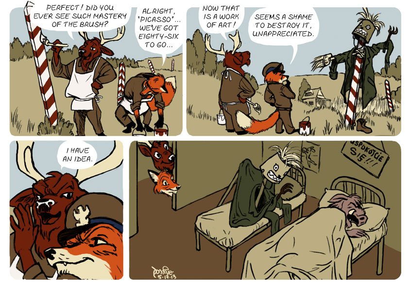
I am still unsatisfied with how long it takes me to produce a comic strip. I worked on this for seven or eight hours. But I did develop an inking method that does two things for me. It allows me to work rather loosely, as I would sketching with a pencil. And it allows me to clean up as I go, creating a rough, high-contrast linework that evokes xerography-era Disney. At least to an extent. I want to experiment with this process further.
Also, as I analyze the color scheme, I’m realizing there’s more I can do to manipulate what James Gurney calls color constancy in his book Color and Light. For the scarecrow’s bucket head, I used a lighter shade in the fourth panel. At a glance it reads as the same color as the bucket head in panel two. I think I want to try a limited palette where I can manipulate neutrals to appear more warm, cool, light or dark based on what context I put them in.
I can’t believe that no one commented on this one. When I saw the last panel I ROFLMAO. I can well imagine what I’D do if I woke up and saw that thing looking at me; it wouldn’t be a pretty sight. LOL.