I’m feeling good about the character designs in this one.
Also, I’m trying that 1960s, “cartoon modern” flavor with the backgrounds again. A much more subtle and effective approach (I think), thanks to some additional research and time to refine what I was trying to achieve. I kept the palette for the background low-contrast and limited to four hues.
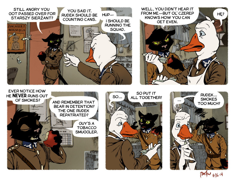
The Sarge really don’t have much in the brains department, do he?
nope hehe :)
You know the old saying about being a silly goose.
Is the webcomic on hiatus?
No, just experiencing delays due to all the work I’m putting into the print edition of comics 1-50. A new comic is already in the works, and should be posted within the week. Thanks for checking in!
Hey, Peter!
I’d just like to say that your artistic improvement in the past 4 years is quite impressive (and as someone who tries to work on my own comic during my non-existant free time, pretty inspiring too). I have shared Rudek and the Bear with a couple of friends, and they seem to approve as well. And that is despite us prefering comic books with more compact plots.
I think your work with the backgrounds (the colors, and treating them similarly to how an animator would, that is) is probably the most intriguing part of the webcomic, other than the basic premise, ofcourse.
May I ask what tips you would give to a relative beginner?
Hi, thanks for your comment!
I guess my advice for a relative beginner would be this: figure out who you think the “masters” are and study their working processes–not their results–as closely as possible. The artists I try to learn from include Milt Kahl, Walt Peregoy, Juanjo Guarnido, and Hayao Miyazaki. To me they are masters when it comes to designing readable and appealing characters, color schemes and layouts that help tell stories, and pacing of panels (in a comic) or shots (in a film). The mistake most beginners make is emulating someone’s STYLE rather than their process. Good luck making comics and thanks for stopping by :)
That’s very nice advice, and pretty refreshing too! Thank you.
I guess that I should look into trying out brush inking (like some BD artists) and perhaps using plastic sheet templates (like Don Rosa).
Here’s a few examples of my work, in case you are curious:
http://imgur.com/nGdgtGO,lUGqwUh,U48BRMZ,F7pfoD5,Hxk7DwT,7JadPKg#0