The Trouble with Comics Lettering
Ideally, I think I would hand-letter Żużel and the Fox. I’d love to pull out the dusty Ames Lettering Guide that has been nestled among my art supplies since my days of taking summer classes at the Joe Kubert School in…like…1997.
But that sure is labor intensive, and I don’t think I’m ready for a lettering project of this scale, because I’m barely confident that I can even pencil and ink the book within the year.
[EDIT: two years and two major script overhauls later, and I’m still doing page layouts!]And I certainly am not going to use a freeware comic lettering font. Ersatz, lazy, run-of-the-mill. I don’t want any aspect of the book to bring those words to mind. A lot of cartoonists out there are comfortable cutting corners when it comes to lettering. And I judge them for it, I do.
Designing Typography my Own Dang Self
So, I’m designing two typefaces: one for general lettering, based on my own handwriting; and one based on Fraktur. I’ll use the Fraktur for the speech that is meant to be “translated” from German for the reader.
“Donacomix”
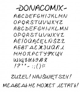
Here’s a draft of the standard comic book text. I wrote out the alphabet and a few pangrams in my normal, all-caps handwriting. Didn’t know what to call it really, so I called it Donacomix.
I added Polish and Cyrillic, since I have characters that speak those languages. I may want to add interjections and curse words in their “untranslated” forms for flavor.
Fraktur!
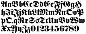
Fraktur presents some legibility issues for the average reader, especially in the forms of some of the capitals. Here’s Fette Fraktur, for example:

And in old German books, I’ve seen worse.
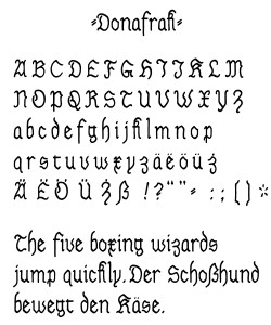
So I’m going to try to do two things: make my Fraktur look hand-lettered with a monoline pen, and redesign the capitals to be more legible to the average reader.
Here’s my first draft:
And here’s a cleaned-up spec sheet.
Both typefaces still have some issues to work out. But at least no one will be able to say my typography is cheap.
A Family Tradition?
My grandfather was a life-long newspaper man. When he was a teenager, he typset his own local paper. Goudy himself sent my granddad some used type and a spec sheet for a memento (I guess Goudy didn’t get much fanmail from teenagers). My dad, too, worked the printing presses at the paper where his father was an editor. I guess typography is in my blood.
But in another way my foray into type design follows in my grandfather’s footsteps. By taking matters into my own unschooled and overzealous hands, rather than using the free stuff that’s out there. We’re particular, we Donahues.


Leave a Reply