Let’s think for a moment about word bubbles. How important is the word bubble font to the overall experience of a comic?
Pretty important. I mean, the word bubble font should match the style of the comic itself, right?
For most of us, there aren’t really too many choices, though.
There’s a conventional style of word bubble font—based mainly in the lettering style of Artie Simek and Sam Rosen in the 1960s. I could use a BlamBot or Comicraft font, sure, but none of them felt right for the 1920s feel I was trying to create in Rudek and the Bear.
My other option: I could hand-letter everything. Yeah, right. There are artists who hand-letter, so their pictures and words have matching quality of line…but it often hurts their legibility. Joann Sfar, for example.
In my own comics, I wanted to avoid these extremes. I wanted my lettering to be legible, but not too cookie-cutter. Appropriate to the medium, but fitting to my own style. So, I tried creating a typeface based on my handwriting, which you can see in the first forty or so webcomics.
My first word bubble font was uneven, though. And, as I gradually realized, not historically appropriate to the aesthetic of the comic. It so happened that my mother-in-law was cleaning out her attic, and found a series of textbooks from a mail-away art course, published in 1953. Of particular interest to me was Book 4: Commercial Lettering.
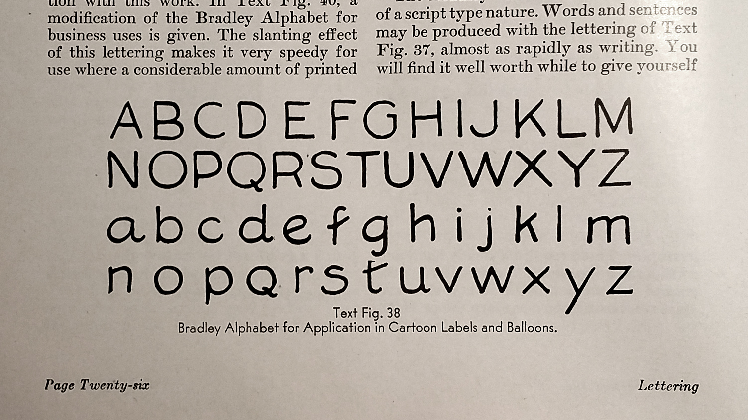
In this book, I found an incredible example of cartoon lettering. The alphabet, drawn by Joseph Almars, is abstracted from the comics of Luther D. Bradley, a cartoonist for the Chicago Daily News in the late 19th and early 20th centuries. Here was an alphabet that was designed for word bubbles, hand lettered, and historically appropriate.
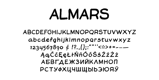
I went to work: I scanned the page, vectorized the letters, adjusted their line weight, introduced a bit of slant, added numerals, some dingbats, Polish support, and Cyrillic characters. I call it Almars.
I retired my original font, and used this one for the next forty comics, starting here.
Here’s the thing. Over the past year, I’ve been studying lettering, calligraphy, and typeface design in my spare time. I found Jessica Hische’s book, In Progress, pretty inspirational. The book presents her creative process and aesthetic decision making through several lettering projects. It also explains in very clear terms the dos and don’ts of building letterforms with vector paths.
I’ve also done some further research into early twentieth-century lettering techniques and styles. I’ve come to respect the work of Ross F. George. If you’ve ever read a Speedball instruction book, you’ve probably seen his alphabets. I also came to admire Eric Sloane’s lettering—squat, businesslike, yet personable.
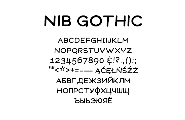
With these new ideas, I’ve been itching for a while to redesign my word bubble font. This summer, I finally got around to it. In homage to comic lettering tools of the past, I’ve called it Nib Gothic.
While I still think Almars holds up, this new word bubble font is a better fit for my comics. And, having designed it from the ground up – rather than vectorizing a scan – I feel more confident in its legibility at different sizes. So, I’ve retired Almars, and put Nib Gothic into use starting with this comic.
Will I find fault with this one in a few years? I wouldn’t be surprised. In fact, I hope I do. That would mean I’ve continued to evolve as an artist and designer.
Personally, I prefer the Almars. I like how it looks next to the images and it really speaks to me as fitting the period and nature of the work. I feel like I’d expect Nib Gothic more in a Peanuts strip than a 20’s strip.
hello, im working on book 2 of my own 1920s set comic, is it possible i could pay you for a ttf of almars?
Totally–I’ll shoot you an email :)
I’d be interested in purchasing ALMARS and NIB GOTHIC fonts if your open to that. Thanks!
i’ll email you!
I’d be interested in purchasing ALMARS and NIB GOTHIC fonts if your open to that. Thanks!
Hey again, it’s been 2 years! haha. I’ll shoot you an email.
Oh man! That Almars is pretty close to the Artie Simek lettering that to me, IS comics lettering! I love it!
I see that others have offered to purchase it and I would LOVE to do the same!
Hi, thanks! I’ll send you an email with details.