Process Experiments
- Tried a different technique to create word bubbles. I used the Oval tool and just kept overlaying ovals on ovals, then with the path selection tool, combined them all into a single path. I think this technique gave me what I was looking for in terms of a clean, yet organic look. However, it was extremely hard to get a large and consistent enough bubble margin. (Is there a term for that? for the amount of white space in the word bubble, to aid legibility?)
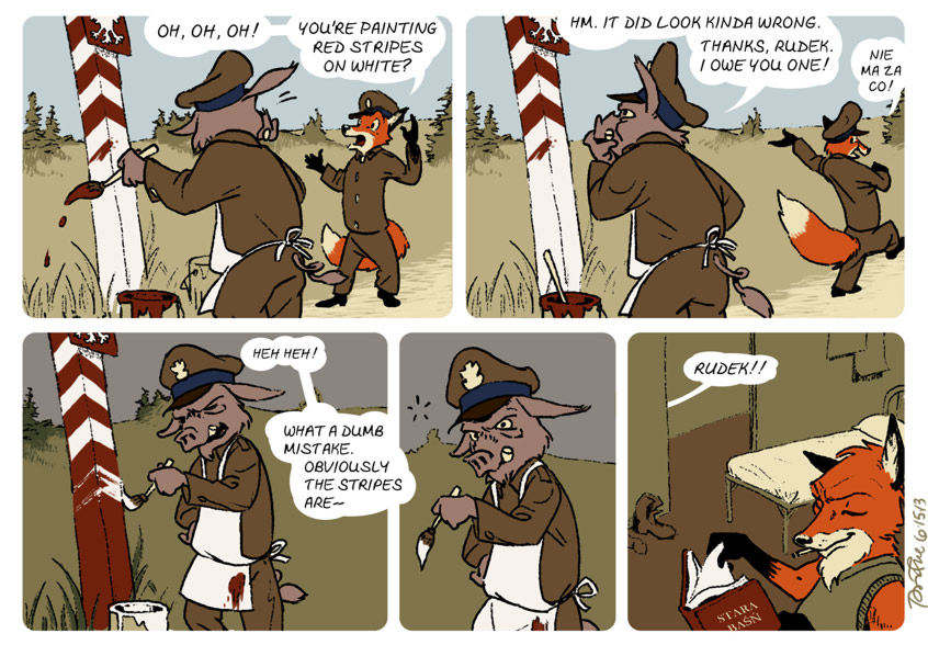
- While this strip was digitally drawn from the ground up, I tried a more traditional inking approach. Less sketchy, more like careful pen strokes. I also used a “grainy” dual brush setting in PhotoShop. Like with the word bubble technique, I was trying to give it a clean yet organic feel.
Finding the Right Facial Expression
I agonized over Lucky’s face in panel four. You can see the rejected sketches here.
One Other Thought
I’ve been enjoying working around the limited palette. But I’m not sure panels 3 and 4 adequately show that a good deal of time has passed. I darkened the sky and landscape, while staying within the 13-color gamut. But I don’t know if the time lapse “reads” clearly enough. What do you think?
I definitely understood that time had passed, enough for Lucky to get steamed about how much of it he had wasted. If you’re still worried though, putting a lantern or something similar out would be additional clarification without having to consider the color palette.
A lantern or some other sign is a good idea! Another possibility: a house in the background, with its windows lit in panels 3-4.
Thanks for the feedback :)
Well, the saying “sly as a fox” isn’t just a saying, is it? LOL.