
The Principles of Animation Apply to Comics
I’ve mentioned elsewhere that although I’m drawing comics, my key influences are animators. My belief is that comics should be drawn in a specific way. The artist should have the reader’s brain in mind. If the reader’s brain can connect all the visual cues provided by the artist, that’s when the story comes to life.
Scott McCloud and others have discussed the theory of closure in comics, and how it engages the mind. A comics reader has to mentally get from panel A to panel B, and close the gap of what happened in between. I think the Principles of Animation are actually driving at this mental engagement.
So, I’ve studied these principles, and they’ve greatly influenced the way I lay out comics panels. Here are the principles as described by Ollie Johnston and Frank Thomas in The Illusion of Life:
- Squash and Stretch
- Anticipation
- Staging
- Straight Ahead Action and Pose to Pose
- Follow Through and Overlapping Action
- Slow In and Slow Out [this is called easing today]
- Arcs
- Secondary Action
- Timing
- Exaggeration
- Solid Drawing
- Appeal
Staging — It Kinda Confuses Me
You can read about each of these more on Wikipedia. The Principle of Animation I have the most trouble with, however, is the one I want to focus on here — Staging.
Johnston and Thomas’s definition, to my thick head, is rather elusive: “the presentation of any idea so that it is completely and unmistakably clear.” I feel like a novice presented with a zen koan when I think about that. I’m unclear on how clarity is to be achieved.
They may actually be talking about a set of principles that all work towards clarity, though. They discuss gesture, for one. Their examples overlap with the concepts of timing and story beats. And they talk about how props and other background imagery relate to clarity. Overall, the vague sense I get is that “staging” is a set of tools for visual communication.
But the more I draw Rudek and the Bear, the more I start to feel I understand. I’ve come to think of staging in a particular way. An image has good staging if, reduced to its basic elements, it still tells a story.
The “story” an image tells could be very basic. But it has to include a conflict and an action that comes out of that conflict.
The “reduced to its basic elements” part of my definition is a bit tricky. I’m going to adopt a test presented by Walt Stanchfield to clarify this: if you reduce the figures to silhouettes, do their gestures and positions still give all the information needed?
So, let’s look at a few panels from Rudek and the Bear. Let’s see if analyzing their staging can give us any insight.
Good Staging

I’ve reduced this panel from “Good Cop, Bad Cop” to silhouettes. Here’s the information we still get:
- a smaller character is attempting to menace a larger character. The gestures are all clear, even in silhouette.
- the two figures in the foreground appear to be in conflict over the figure in the background. In the theater, you’d say the background figure is “upstaging” the others, which puts the narrative tension on him, even though the immediate conflict seems to be between the figures in the foreground.
- In short, we are seeing a slice of what we can deduce is a more complex set of relationships.
Bad Staging
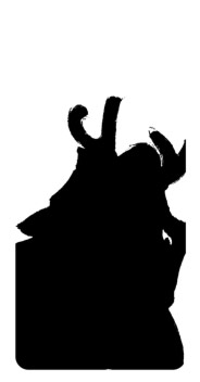
This panel from “Smooth Talkin’” has some problems. Out of context, in silhouette, what information do we still get?
- Maybe this is a character with antlers. The top of his antlers are cut off by a word bubble, so we can’t even be sure about what we’re seeing there.
- The character is… leaning, maybe.
- Um…is that a mustache? or an upturned collar? or what?
Say I wanted to fix this. I’d probably zoom out–give the character more room to use gestures to communicate. The joke of the comic requires him to be facing forward, so we still lose the mouth, which would help clarify things. But we’d at least get ears and antlers, which would give us emotional information from gestures (ears up or down? which way is the head tilted?).
Complex Staging
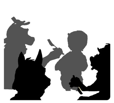 Here’s a panel from “New Recruit,” which I’m still in the process of drawing. I’m not calling this one good or bad. I think it only passes the test if you look at it for a while. So it’s storytelling isn’t immediately clear, which is the objective of staging. But maybe its complexity can offer subtle information, or subtext:
- Three characters are eating, and a fourth is approaching. The fourth seems to be on the outside, socially, even though the deer is smiling and potentially accepting him.
- The deer’s gesture is specific: he had raised his fork to eat, but that action was interrupted. He tilts his hand to indicate the approach of the background figure. This tells us the focus or tension is centered on that figure, but the process of eating will continue. In other words, the seated group will not stop what they are doing and reorient themselves to the new arrival.
- The fox in the extreme foreground, even in silhouette, seems thoughtful. A lack of extreme gesture, when contrasted against more active characters, often suggests the character is thinking.
Maybe I’ll have a different opinion about this panel in the future. Maybe I’m reading into it, and seeing what I want it to communicate. But at least I think it’s clearer than my second example, in terms of telling a story.
Staging in Comics and Beyond
So, what do these analyses add up to? I think the concept of staging is both a valuable principle to keep in mind while drawing, and a powerful diagnostic tool. The concept of staging was borrowed from the theater; Johston and Thomas all but say so. Now I’m borrowing it from the principles of animation to say it applies to comics. I suspect it could be transferred to other art disciplines as well. What do you think?
Leave a Reply