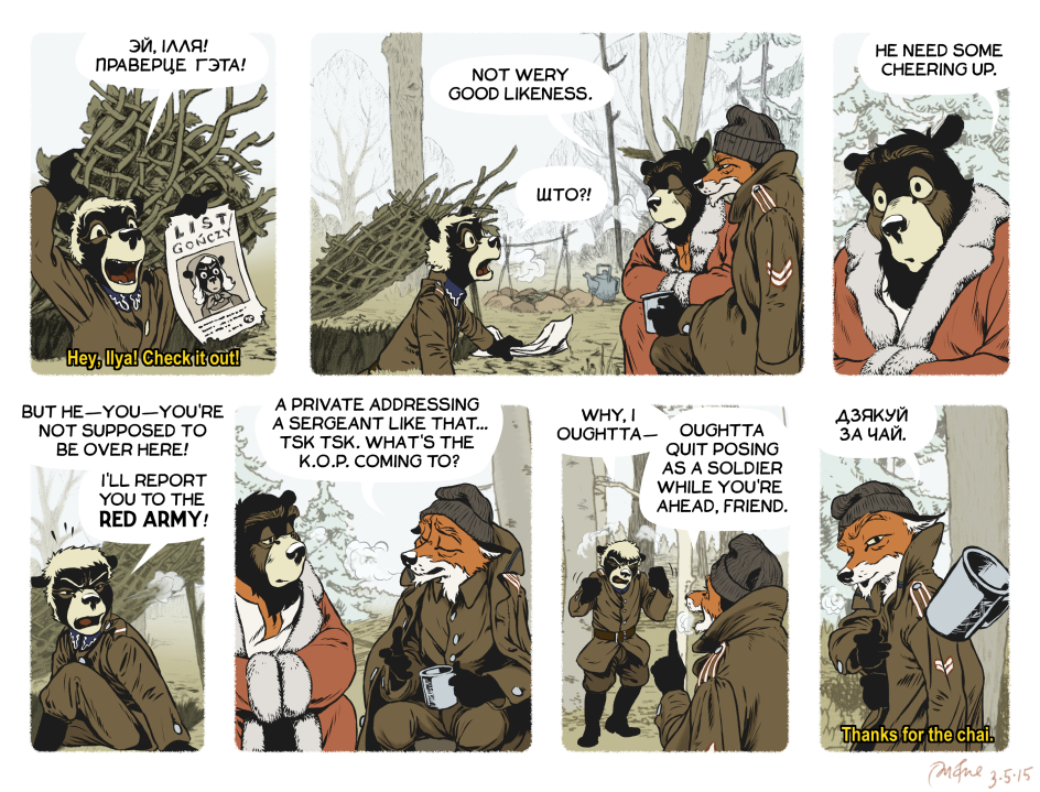
I’m trying out subtitles on this comic. In previous episodes featuring Belarusian, readers were likely to ask for translation. There are a couple different ways to handle that, but I figured I would see what it looked like to do movie-style subtitles. What are your thoughts? Is it intrusive? I’m not sure.
Friendly Advice
I don’t find the subtitles intrusive.
Whoa, it’s difficult to pinpoint the reason to a single aspect, but this one is absolutely beautiful.
-Great job with the cold, flat colors.
-The soft focus on the background is really nice.
-The expressions are so damn good. Rudek’s are downright thespian!
-It feels as if the last panel is from a movie.
Hah, I’m actually jealous! Only thing I could suggest improving is outlining the bubbles. They frequently clash with the light sky, and it’s especially obvious in this strip.
Btw, I wasn’t expecting you to jump from the PTSD triggering scene to after Rudek had recovered. I think you did a good job evading a melodramatic cliche back there.
Thanks very much for the feedback!
The wordbubble issue is one I’ve definitely been thinking about, too.
I like the translations. There’s no way to get them through a translation webpage, since my keyboard doesn’t use cyrillic. By the way, you missed one: What’s wto mean?
“што?!” means “what?!” :)
Actually, the subtitles are perfect. They do remind me of movie subtitles, but specifically anime. The yellow color really helps them stand out from the background. If you have time and/or inclination, you might retrofit some of the earlier strips.
That said, both Masha and Malutki seem to have sprouted antlers in this episode.
Since you asked for feedback:
The subtitles work really well. I’d stick with them.
The word bubbles *are* hard to see … I would suggest darkening the blue of the sky in order to enhance the contrast, rather than trying to outline the bubbles themselves.
It all looks great!
Thanks! I am leaning towards that solution for word bubbles. Outlines or tinted word bubbles just don’t seem as elegant to me.
G’day, I agree with the general opinion, the subtitles are a very good idea… it allows you to keep with the authenticity and feel of the strip while saving you from becoming buried in emails asking for translations. ;-)
On the word bubbles… while many now-a-days go for coloured bubbles or contrast bubbles, there is a lot to be said in favour of the traditional outlined bubble…. generally they work on almost any background or scenario whereas the others can more often strike situations where a background (or lack thereof) can leave them stranded or looking out of place. That said, it is your show and the choice you prefer is far more important than any technical or traditional argument… ultimately, go with whatever feels right to you!