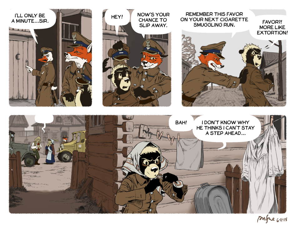
Spent a good number of hours on this one. Decided to push the realism on the details of the uniforms, and develop some new backgrounds. For a while I’ve felt like my depictions of the town, Stołpce, were lacking. After some additional research, I feel pretty good about the look of the town in this one. Of course, there wouldn’t be a privy right up against the sidewalk, but you’ve got to bend the rules to tell the story sometimes.
I’ve also synthesized a number of techniques and effects I’ve been trying out in the last few comics. The inks on the characters are faded–except for Masha in the final panel. The backgrounds are colored with a very limited palette–this time, just one hue, its tints and shades. And finally, I made liberal use of MangaStudio’s perspective ruler.
Also in that last panel? Those are probably the tiniest figures I’ve drawn in the comic.
http://bit.ly/1MvxTPA
you’re gonna make me cry! that doleful dog’s got some bad news and kasia has some serious mother rabbit vibes in that panel.
‘ave you no ‘eart? We all scrimped and saved to give it to ‘im!
Oh, that’s my favorite movie! “That…(snif)…mean ol’ sheriff…took my…birthday…present.”
did ‘e now? Be a stout-hearted lad and don’t let it getcha down!
All those hours have not gone to waste! It really shows — in the little things, like Rudek popping the button on Masha’s epaulette in Panel 2, the street/background perspective in P3 and the perspective of the corner of the building in P4.
As for the Slip; well, there’s a full dressing gown, which will probably become a part of Masha’s babushka mash-up.
“in the little things, like Rudek popping the button on Masha’s epaulette ”
Oh wow, I didn’t even notice that. Great detail.
Though I personally would rather the lineart was a little bit stronger.
Another small detail, but the last panel would work better if the dog didn’t have an empty bubble hovering over him. It’s unnecessary– we can see that he is talking to Kasia without it.
These are good criticisms. The linework did end up a bit washed out somehow. And I see what you’re saying about the word bubble.
“The linework did end up a bit washed out somehow.”
If the objective is to make it blend into the background better, you could try coloring the lineart itself, I think Disney does it a lot.
In Photoshop, you just color a new layer over the lineart one and set it to “Screen”.